Push Notifications: What to Push, What Not to Push, and How Often
Push notifications can be considered a form of recommender system, where instead of showing recommendations directly on a website or app, we proactively send suggestions via email or mobile alerts. While this may seem like a small change, it leads to meaningful differences in how people engage with pushes versus regular recommendations.
How does push differ from recsys or search?
One difference is that with pushes, we don’t know the customer’s intent. Compare this to search, where the intent is made obvious via the search query. Or recommendations on the website or app, where we can guess the intent based on the context, such as the product page a user is browsing or their in-session activity. But with pushes, we have to guess what the customer might be interested in given triggers such as events, promotional offers, or location. Thus, as we go from search to recommendations to pushes, it becomes harder to understand the customer’s intent.

The user's intent is less clear as we go from search to recommendations to push/email
Another difference is that the form of the notification may matter more than the product recommended. Alibaba found that personalized pushes which convey why an item matters—to the customer—increased open rates. For example, tying the push to the customer’s activities, such as suggesting complementary products based on a recent purchase. DPG Media suggests explaining why users are receiving new notifications, such as having previously signed up for updates or including information about the topic or location. The transparency helps the push feel less random and may encourage forgiveness when it misses the mark on relevance.
Another challenge is that irrelevant or unwelcomed pushes risk having the user disable notifications, uninstall apps, or start ignoring them due to low usefulness. This results in a permanent loss of a channel for sharing timely, useful information, leading to reduced app usage. Unfortunately, as Twitter found, most recommendation engines take a myopic view, over-optimizing on immediate user responses at the cost of long-term satisfaction.
Some other differences between push notifications and conventional recommendations:
- Timeliness is critical as pushes related to breaking news, offers, or new product releases may no longer be relevant after a period. If they’re not timely, they lose relevance quickly. In contrast, recommendations tend to be more evergreen.
- Tight space constraints often mean that we have room to highlight only a single recommended item per push.
- Message caps limit the number of pushes each customer can receive within a day or week, to avoid overwhelming users and risk unsubscribes.
- Pushes are more often tied to external events such as limited-time discounts or news while recommendation updates are typically based on site activity.
- Pushes tend to focus on precision and timeliness while recommendations value diversity, freshness, and other objectives.
Next, we’ll discuss what to push versus what not to push. Generally, “what to push” is about being helpful while “what not to push” tackles being harmless. The former is more relevant for use cases in e-commerce or education where we want to generate proactive suggestions such as reading recommendations or study reminders. The latter is more relevant in use cases such as social media or news where the volume of organic events is already high and we want to filter pushes that will likely underperform or annoy users.
Also related is volume control: How many pushes until diminishing returns is reached, or notifications are disabled? While engaged users may appreciate multiple well-targeted pushes a day, less active users may prefer a few thoughtful pushes a week so that their normal flow isn’t disrupted. The ideal frequency varies from individual to individual.
What to push: Being helpful and engaging
Alibaba found that pushes for products that complement a customer’s past purchases increased open rates. They hypothesized that, by recommending complementary products, they built an explicit connection to the customer’s purchase history, as opposed to personalized recommendations or top-sellers.
Intuitively, it makes sense that recommending complements (instead of substitutes) for push notifications does well. Complements are products that are bought in addition to the previous product while substitutes are products that are bought instead of another product. Thus, complements enhance each other’s value while substitutes are alternatives. For example, phone accessories complement an iPhone while a Google Pixel is a substitute for an iPhone. One concern is that recommending substitutes via pushes may annoy customers by being redundant since they already own a substitute product.
To identify strongly complementary products, they first computed a complement score \(p_{ij}\) and a substitute score \(q_{ij}\) between all products \(i\) and \(j\). The complement score measures the probability of purchasing \(j\) after purchasing \(i\):
\[p_{ij} = \frac{\sum_{u \in U} A_{ui} A_{uj} \mathbb{1}(t(A_{uj}) > t(A_{ui}))}{\sqrt{\sum_{u \in U} A_{ui}^2} \sqrt{\sum_{u \in U} A_{uj}^2}}\]\(A_{ui}\) represents the user \(u\) purchasing product \(i\) while \(t(A_{ui})\) is the timestamp of the purchase. Essentially, \(j\) is a complement of \(i\) if \(j\) is purchased after \(i\) is purchased.
The substitute score is defined similarly but based on view of \(i\) and purchases of \(j\):
\[q_{ij} = \frac{\sum_{u \in U} B_{ui} A_{uj} \mathbb{1}(t(A_{uj}) > t(B_{ui}))}{\sqrt{\sum_{u \in U} B_{ui}^2} \sqrt{\sum_{u \in U} A_{uj}^2}}\]\(B_{ui}\) represents the user \(u\) viewing product \(i\) while \(t(B_{ui})\) is the timestamp of the view event. At the risk of oversimplification, \(j\) is a substitute of \(i\) if \(j\) is purchased after \(i\) is viewed.
Then, by subtracting the substitute score from the complement score, they can compute the strongly complementary score \(s_{ij} = p_{ij} - q_{ij}\). Products with high \(s_{ij}\) are strong complements and thus used as candidates for pushes.
They also trained a mixture model to represent different cohorts of users that are more inclined towards either popular products or complementary products. The model learns each cohort’s latent preferences and recommends products accordingly. (With modern contextual recommenders, we’d likely train a two-tower network or transformer that can learn directly from customers’ historical behavior and context.)
Overall, complementary recommendation (CPR) increased open rate by 44% relative to generic personalized recommendations (PPR). Combining it with a mixture model (with four cohorts \(k\)) led to a further 11% improvement.
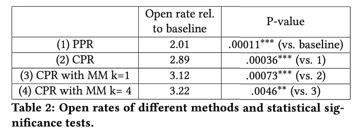
Increase in open rates across various treatments
JOOL Health, a mental health and behavioral change app, found that power users and regular users had different preferences for push notification templates. Specifically, power users preferred notifications that were based on their historical monitoring data while regular users preferred more generic notifications.
Their goal was to encourage users to open the app and self-report on various well-being factors such as sleep, creativity, energy, and willpower. They tested two notification types:
- Suggestions: Broad tips like “Taking longer, slower breaths can boost willpower”
- Insights: Personalized updates based on historical data such as “Your willpower outlook is high tomorrow and it’s an opportunity to build a healthy new habit”
Overall, relative to personalized insights, generic suggestions led to more app interactions and monitoring. However, for highly active users, insights increased engagement while the generic suggestions reduced interaction and monitoring.
They hypothesized that because new users have limited recorded data, personalized insights lacked the depth to be relevant compared to generic suggestions. Thus, simple tips worked better initially. But as they use the app more regularly, the depth of personalized insights increases and thus becomes more meaningful than broad suggestions.
Duolingo also shared about their custom multi-armed bandit (MAB) that explores and selects high-performing push notification templates. In their setup, each arm is a template variant and the reward is user engagement.
The goal was to address two challenges. First, repeating the same template leads to familiarity and diminishing returns on engagement. Thus, fresher templates that a user hasn’t seen recently have a higher impact. Second, not all templates are eligible in all situations. Some are only eligible if the user is on a streak, while others are eligible if the user has indicated a travel preference.
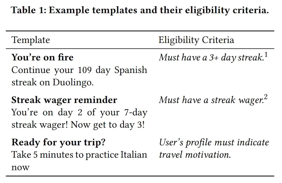
Various Duolingo push notification templates and their eligibility criteria
To incorporate these dynamics, Duolingo drew inspiration from “recovering bandits” and “sleeping bandits”. In the former, an arm’s expected reward is based on the number of rounds since the arm was last chosen—more recently chosen arms received less reward. For the latter, certain arms, such as ineligible templates, are inactive for some rounds.
To implement recovering arms, they had a recency penalty for an arm if it was previously selected for a given user. The goal is to give fresher templates a novelty boost. The penalty decreases over time to mimic fading memory, and the modified score \(s_{a,t}^*\) of arm \(a\) is:
\[s_{a,t}^* = \bar{s}_a - \gamma0.5^{s_{d_a,t/h}}\]\(d_{a, t}\) is the number of days since arm \(a\) was selected for the user. \(\gamma\) and \(h\) are hyperparameters representing the base recency penalty and the decay half-life.
To implement sleeping arms, they measured each arm’s value while controlling for eligibility. Specifically, they used historical data to estimate the reward/utility when the arm is eligible and used (\(\mu_{a}^{+}\)) and when the arm is eligible and not used (\(\mu_{a}^{-}\)). Thus, taking the difference controls for eligibility effects, where both values are estimated from feedback that meets the same eligibility criteria, isolating the template’s true impact.
\[\bar{s}_a = \frac{\bar{\mu}^+_a - \bar{\mu}^-_a}{\bar{\mu}_a}\]In online experiments, this approach increased DAU by 0.5% and lessons completed by 0.4%. Notably, new user retention also increased by 2%, suggesting that the optimized notifications and template variety helped to retain new learners.
Finally, DPG media shared their approach for news-related push notifications. One of their objectives was to provide hyper-local personalization by pushing notifications for news that was happening near the user.
To enable this, they developed a location overlap scoring function that blends two ratios:
- Ratio of locations extracted from article relative to locations the user has previously read about. This captures location preference based on reading history.
- Ratio of locations extracted from article relative to locations the user has physically visited while using the app. This captures relevance based on the user’s location.
These scores are blended at 7:3 to weigh location preference higher. Then, it’s combined with a content similarity score that is based on cosine similarity between the article and the user’s past reading. The content embeddings were based on a word2vec model.
What not to push: Being harmless and unobtrusive
In contrast to the section above that focused on selecting the best items or templates for pushes, this section focuses on filtering pushes that are likely to underperform.
LinkedIn addressed this by predicting which pushes were less likely to be engaged on. First, they split notifications into two categories:
- Always notify: High-priority events such as messages and connection requests
- Filter-eligible: Activities in the user’s network, such as shares, mentions, and connections being mentioned in the news

Shared-by-your-network, Posted-by-your-network, Talking-about, Mentioned-in-the-news
Filter-eligible events tend to have higher volume but lower signal and thus need to be filtered. These notifications are also decorated with interpretable reasons, such as “Jill shared for the first time”, to help users understand why they were notified.
Their push notification system mirrors the design of a conventional recsys, where they first select candidate recipients for each event (retrieval) before filtering events that are predicted to have low response (ranking and filtering).
For retrieval, they first select candidate recipients for each event via edge affinity and connection strength. Edge affinity retrieves users who have recently interacted with the actor’s updates. This is effective for users who frequently use the LinkedIn feed and engage with it. Connection strength is the probability of two users interacting on LinkedIn outside of the feed—this allowed LinkedIn to expand the candidate set to 10x the pool of users offered via edge affinity. This benefits newly onboarded or less engaged users.
Then, to ensure that each push is likely to be engaged on, they score candidates via a response prediction model. To bootstrap training data for this model, they started with a heuristic model based on affinity features where pushes were sent only when affinity features exceeded a threshold. Once they had collected enough feedback data, they transitioned to logistic regression with L2 regularization.
I found it interesting that, beyond the standard offline evaluation metric of ROC-AUC, they also measured the observed-to-expected ratio. This is computed as the number of positive test samples (observed) divided by the sum of predicted probabilities for all test samples (expected). A ratio of 1 was ideal. This ensured that the model’s predictions were calibrated and it wasn’t over or under-sending pushes in production.
Pinterest adopted a slightly different approach to filtering push notifications: Instead of predicting whether a user would engage with a notification, they focused on whether a notification would cause the user to unsubscribe.
To collect unbiased training data for the unsubscribe prediction model \(p(s_{unsub}\vert u, k_u)\), Pinterest randomly assigned each user \(u\) a maximum number of notifications they could receive a week (i.e., notification volume \(k_u\)) and collected their responses. Users that unsubscribed would be assigned a positive label while users that continue to subscribe would receive a negative label.
The key insight was to learn on the assigned notification volume \(k_u\) instead of the actual number of notifications sent. This avoided survivorship bias, because if a user had unsubscribed, they could not have received any more notifications. As a result, users with fewer sent notifications seemed more likely to unsubscribe even though the assigned volume was the real driver.
They also trained an unsubscribe long-term effect model \(p(aL \vert u,s_{unsub})\) to predict user activity after unsubscribing. Specifically, the model predicts that, if a user unsubscribes, how many active days the user would have in the fifth week. They found a four-week delay to be a good balance—enough time for user activity to stabilize yet not too long to slow down data collection and the feedback loop.
How many to push: Reducing unsubscribes
A challenge unique to pushes is determining the right notification volume for each user. While sending more pushes drives engagement, they also risk annoying users or being perceived as spam. What we want to prevent is users unsubscribing or uninstalling the app.
Continuing from the section above, Pinterest computed the weekly notification volume for each user and stored it in an online key-value store keyed on user ID. The reward function for notification volume approximates the long-term effect of notification volume \(k_u\) on the activeness \(a\) of user \(u\):
\[p(a|u, k_u) = \sum_{s} p(s|u, k_u) \times p(a|u, k_u, s)\]\(p(s \vert u, k_u)\) is the probability of user performing action \(s\) in the week, given notification volume \(k_u\). In addition, \(p(a \vert u, k_u, s)\) is the estimate of user activeness \(a\) given notification volume \(k_u\) and action \(s\). To simplify the model, they considered only two possible user actions: unsubscribe \(s_{unsub}\) or continue to subscribe \(s_{sub}\). With these two actions, the reward function can be simplified into the following:
\[p(a|u,k_u)=p(s_{unsub}|u,k_u)×p(aL|u,s_{unsub})+ (1−p(s_{unsub}|u,k_u))×p(a|u,k_u,s_{sub})\]The first half of the reward function estimates the long-term activeness of users who unsubscribe via \(p(s_{unsub} \vert u,k_u)×p(aL \vert u,s_{unsub})\). The second half estimates the activeness of users who continue to subscribe via \((1−p(s_{unsub} \vert u,k_u))×p(a \vert u,k_u,s_{sub})\). This reward function is modeled by three components: (i) probability of unsubscribing, (ii) long-term activity of unsubscribed users, and (iii) predicted activity.
We’ve discussed the first two components in the previous section. To predict activity \(p(a \vert u,k_u,s_{sub})\), they trained a non-linear model (XGBoost) to predict the daily activity for each user given the user and weekly notification volume.
With the reward function and the three models above, they can then score the incremental value of each additional notification. The goal is to filter pushes with low incremental value while staying within a limited number of notifications. They first compute the optimal budget \(i_{max}\) where the incremental value from notifications is maximized. Then, they increase the budget until the incremental value of an additional push falls below a threshold. This algorithm was implemented and scaled via map-reduce.
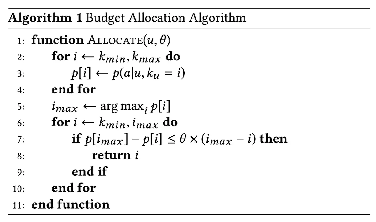
How Pinterest allocates notification budget for each user
As a result, they were able to reduce notification volume by 6-24% while increasing CTR by 11-31% and site engagement metrics by 1-3%.
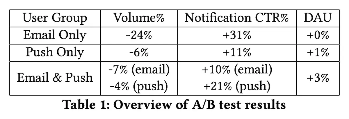
Reduced volume from notifications but with increased DAU
Interestingly, they observed that the model shifted volume from more active users (Figure 5 below) to less active users (Figure 6 below). For core users (who had saved a pin on more than 4 days in the last 28 days), they received fewer emails without a significant decrease in DAU or WAU. Meanwhile, marginal users (who were active 1-3 days in the past 28 days) received more emails which also increased their email clicks, DAU, and WAU.
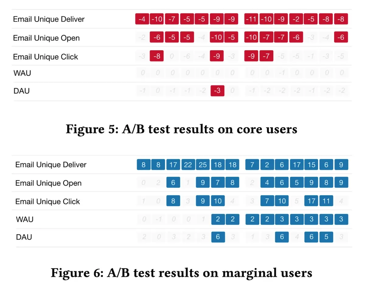
Email volume decreased for core users but increased for marginal users
Twitter also shared about their cohort-level and personalized volume control (aka push caps). For the cohort model, they used a hidden Markov model (HMM) to segment users based on sequences of actions such as no login, login without opening the push, and open push (which implicitly includes logins). Using cohorts made it easier to learn optimal push caps since there was more data to learn from.
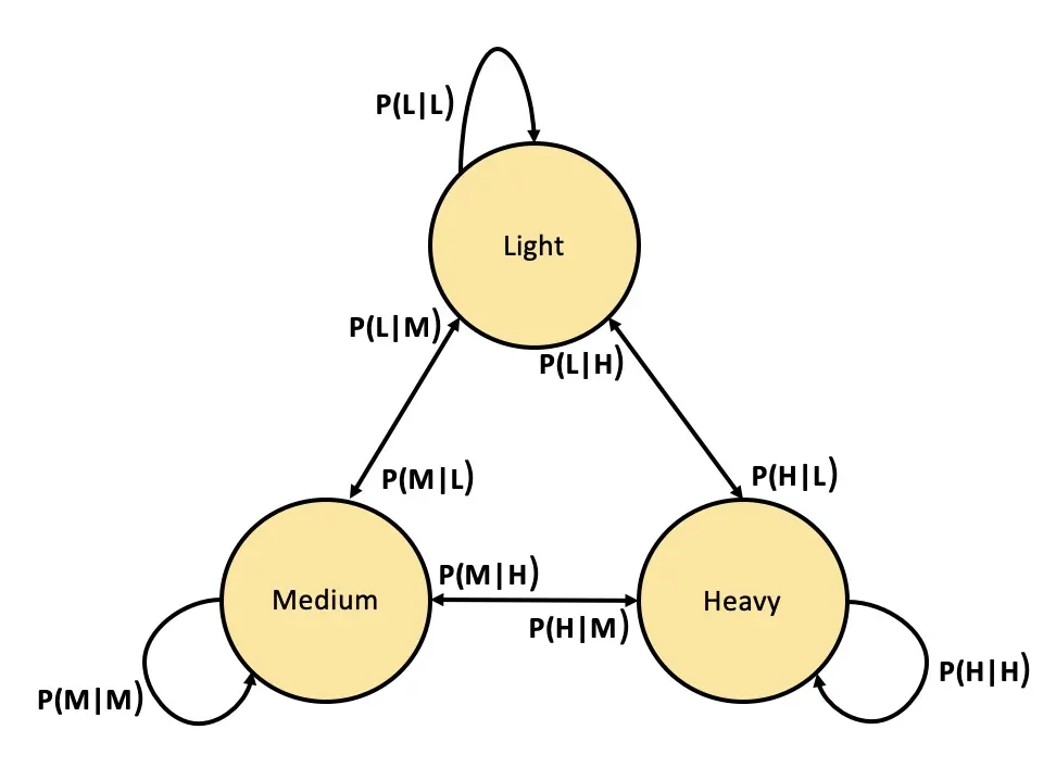
Hypothetical three-state HMM
To tune the number of states, they trained multiple HMMs (with different numbers of states) and found that having six states led to a stable system that had good predictive performance on logins and opens. Then, to determine the optimal push cap for each state, they did a grid search via online A/B testing, selecting push caps that optimized for DAU and reachability. Reachability is defined as the number of people who choose to receive notifications from Twitter (i.e., the opposite of unsubscribe).
While effective, the HMM-based model was limited by its simplicity. It was challenging to add more complex features (as more features led to more dimensions in the HMM). Thus, they augmented it with a neural network that predicted the long-term utility a customer receives based on a given push cap. Similar to Pinterest, they also collected labels after a delayed period (two months), reasoning that while a customer may initially respond to high push caps by opening notifications and logging on often, they may eventually become desensitized and reduce log-ins over a longer period of time.
To balance between DAU (proxied via logins) and reachability, they weighted both via parameter \(\alpha\). Given features \(x\) and push cap \(c\), the reward function for utility is defined as:
\[U_x(c) = \sum(\text{logins}|x, c) + \alpha \times p(\text{reachability}|x, c)\]When \(\alpha = 0\), the push cap with the highest login prediction is selected. But as \(\alpha\) increases, the reward function selects push caps that maintain reachability.
For less active users, the cohort model performed better than personalized push caps due to cohorts having more data than an individual user. The cohort-based push caps were also easier to maintain: They simply updated a customer’s push cap whenever the HMM predicted that the customer had transitioned to a new state. Nonetheless, for more active users, the personalized push caps performed better.
As a result, they increased DAU by 0.62% on iOS and 0.39% on Android while having insignificant reachability loss.
• • •
That’s all for this dive into push notifications! Compared to other topics in discovery (e.g., recsys, ranking, search), resources for push notifications are sparser and have fewer common patterns. Nonetheless, some of these ideas are also applicable to how we design recsys, such as recommending complementary products, improving explainability, and limiting impressions, as well as calibrating models via the observed-to-expected ratio.
What other resources on push notifications have you found useful? Please reach out!
References
- Zhao, Huasha, et al. “Recommending complementary products in e-commerce push notifications with a mixture model approach.” Proceedings of the 40th International ACM SIGIR Conference on Research and Development in Information Retrieval. 2017.
- Loni, Babak, et al. “Personalized push notifications for news recommendation.” 2nd Workshop on Online Recommender Systems and User Modeling. PMLR, 2019.
- O’Brien, Conor, et al. “Should i send this notification? Optimizing push notifications decision making by modeling the future.” arXiv preprint arXiv:2202.08812 (2022).
- Bidargaddi, Niranjan, et al. “Predicting which type of push notification content motivates users to engage in a self-monitoring app.” Preventive medicine reports 11 (2018): 267-273.
- Yancey, Kevin P., and Burr Settles. “A sleeping, recovering bandit algorithm for optimizing recurring notifications.” Proceedings of the 26th ACM SIGKDD International Conference on Knowledge Discovery & Data Mining. 2020.
- Gao, Yan, et al. “Near real-time optimization of activity-based notifications.” Proceedings of the 24th ACM SIGKDD International Conference on Knowledge Discovery & Data Mining. 2018.
- Zhao, Bo, et al. “Notification volume control and optimization system at Pinterest.” Proceedings of the 24th ACM SIGKDD International Conference on Knowledge Discovery & Data Mining. 2018.
- Biyani, Prakhar, and Ragain, Stephen “A hybrid approach to personalize notification volume Twitter Engineering Blog. 2022.
- Yue, Yuguang, et al. “Learning to Rank For Push Notifications Using Pairwise Expected Regret.” arXiv preprint arXiv:2201.07681 (2022).
- Okoshi, Tadashi, Kota Tsubouchi, and Hideyuki Tokuda. “Real-world product deployment of adaptive push notification scheduling on smartphones.” Proceedings of the 25th ACM SIGKDD International Conference on Knowledge Discovery & Data Mining. 2019.
- Yuan, Yiping, et al. “A state transition model for mobile notifications via survival analysis.” Proceedings of the Twelfth ACM International Conference on Web Search and Data Mining. 2019.
- Yuan, Yiping, et al. “Offline reinforcement learning for mobile notifications.” Proceedings of the 31st ACM International Conference on Information & Knowledge Management. 2022.
If you found this useful, please cite this write-up as:
Yan, Ziyou. (Dec 2023). Push Notifications: What to Push, What Not to Push, and How Often. eugeneyan.com. https://eugeneyan.com/writing/push/.
or
@article{yan2023push,
  title   = {Push Notifications: What to Push, What Not to Push, and How Often},
  author  = {Yan, Ziyou},
  journal = {eugeneyan.com},
  year    = {2023},
  month   = {Dec},
  url     = {https://eugeneyan.com/writing/push/}
}
Share on:
Browse related tags: [ teardown recsys machinelearning production ] or
Join 11,800+ readers getting updates on machine learning, RecSys, LLMs, and engineering.